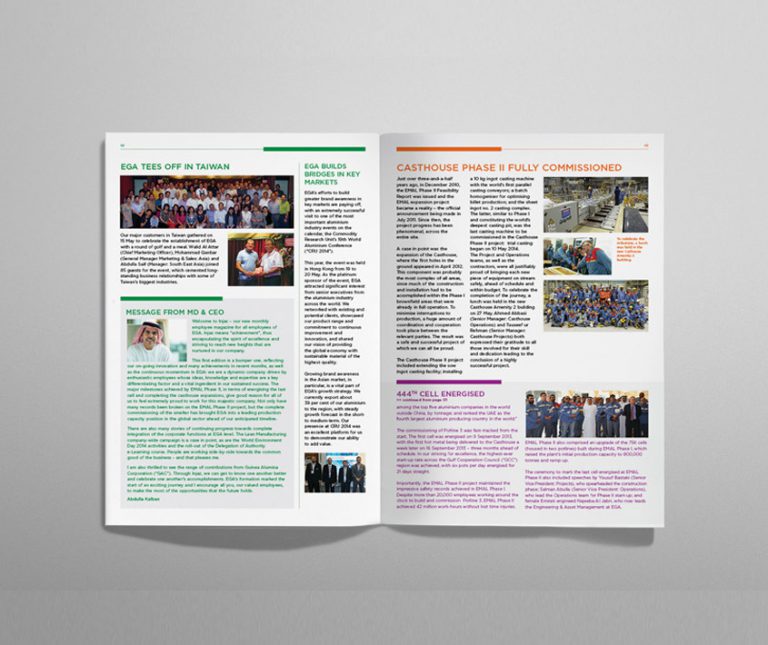
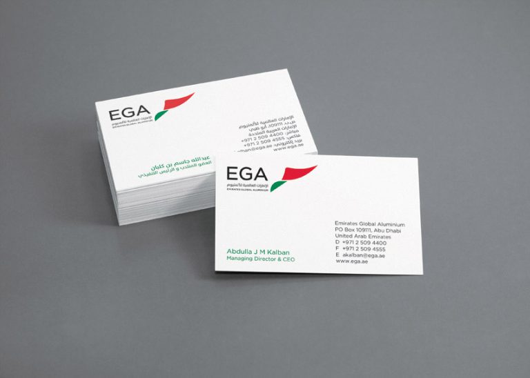
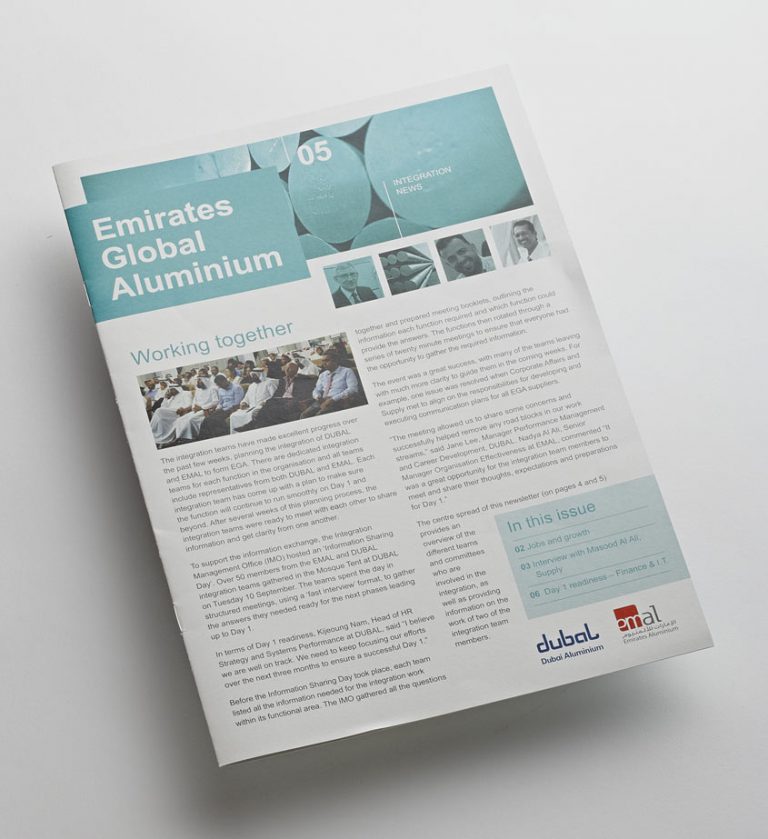
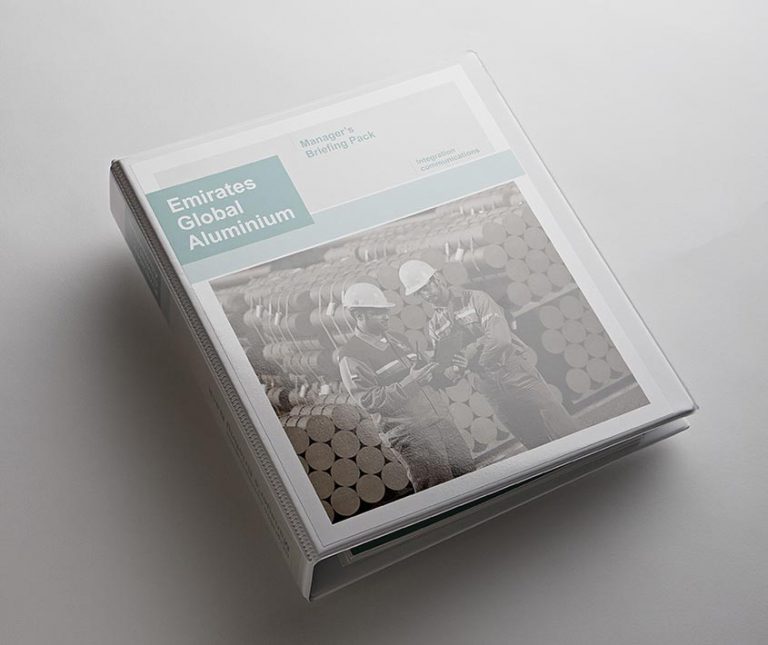
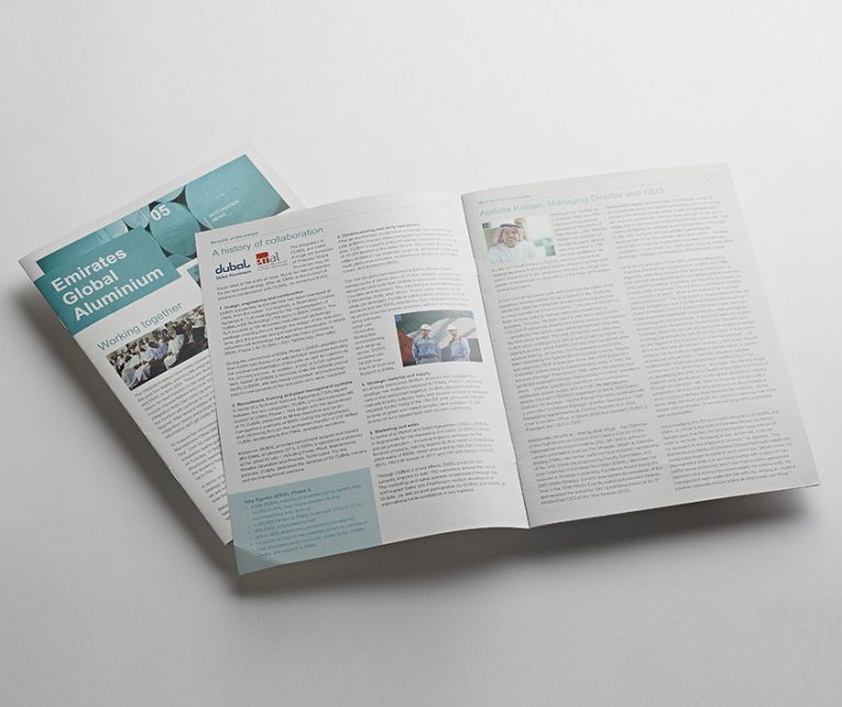
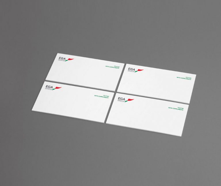
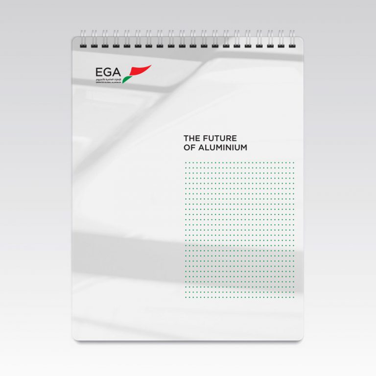
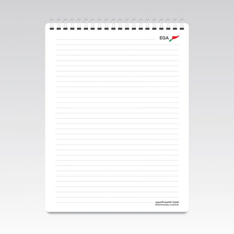
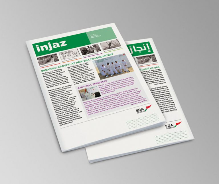
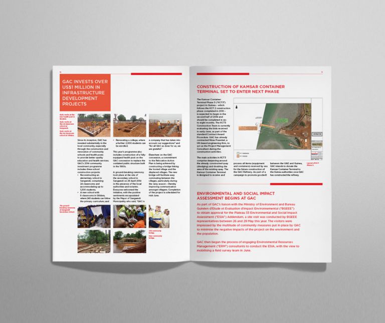
Client: Emirates Global Aluminium Work: Branding, brandmark, collateral
Emirates Global Aluminium (formally Dubal and Emal) – We had previously produced Dubals brochures, giveaway merchandise, newsletters and calendars. The company merged with Emal to become Emirates Global Aluminium (EGA).
Brief To take on the new EGA logo and brand guidelines, ensuring their successful introduction and consistency across all communication channels.
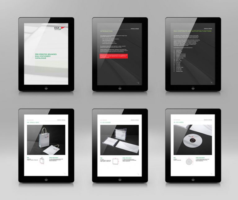
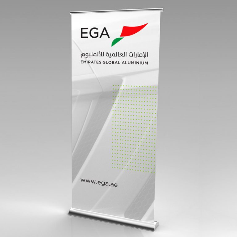
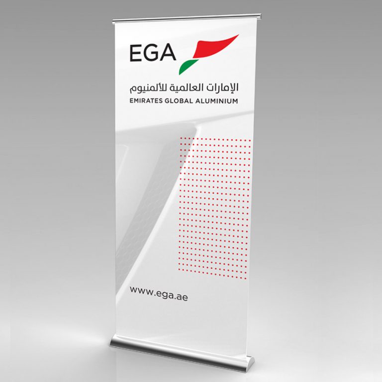
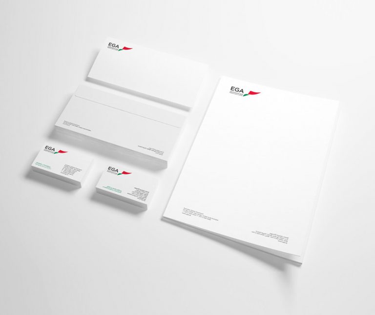
Solution We produced corporate stationery, newsletters, an internal stationery catalog, wrapping paper, roll ups, notebooks, CD covers, certificates to be used internally, a corporate folder and e-templates for each division to send digitally.
Result A completely cohesive brand and a thoroughly satisfied client!
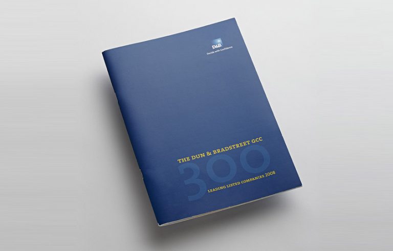
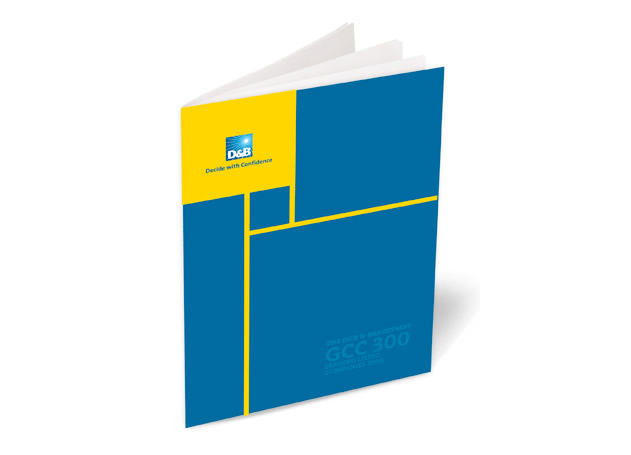
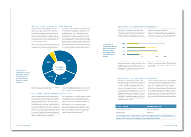
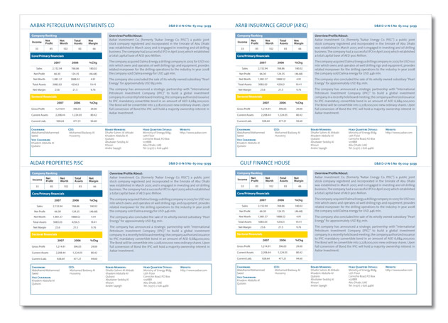
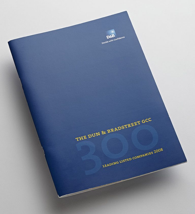
Client: Dun & Bradstreet Work: Direct Mailer, Editorial Design
Dun & Bradstreet is the world’s leading source of business information and insight, with a global database containing more than 200 million business records.
Brief The client requested a directory featuring the top-performing companies, in which the information would be segregated according to industry, income, growth and ranking. The challenge was to counter the data-rich nature of the publication with a modern, visually pleasing design, ensuring user-friendly access to the information.
Solution We devised a clean-cut, corporate design grid with well-defined information categories, making bold use of colour with graphic elements, and creating a well-balanced, appealing publication
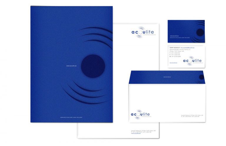
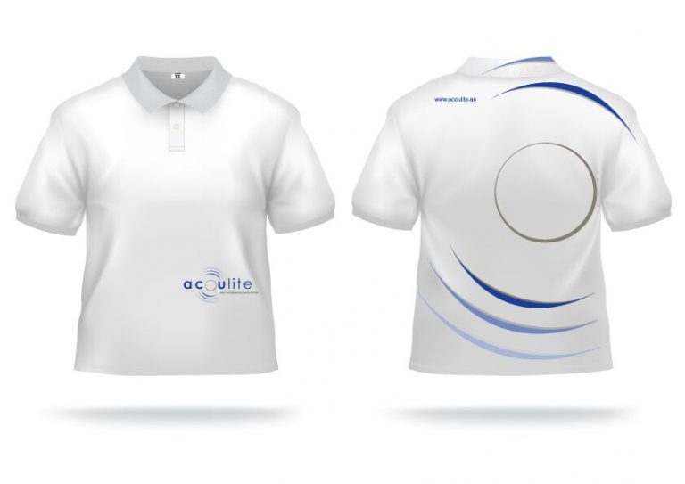
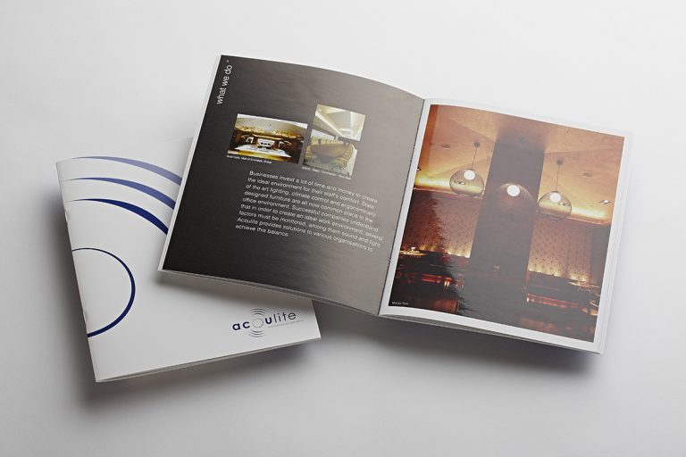
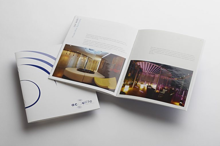
Acoulite furnishes acoustic and lighting solutions, operating across Qatar, Kuwait, Abu Dhabi and Saudi Arabia.
Brief The initial brief included a logo tweak and corporate pre-qualification brochure.
Solution After viewing our initial logo re-design, Acoulite engaged us for a complete rebranding programme – from their stationery, website, presentation templates, stock books, templates for CAD presentations, internal documents and tee shirts for event sponsorship.
Result
Our new logo used colours based on sound and light waves, which represented the full spectrum of the company’s services and successfully carried across all collateral
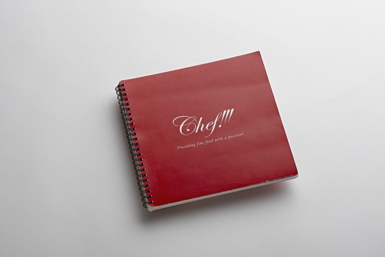
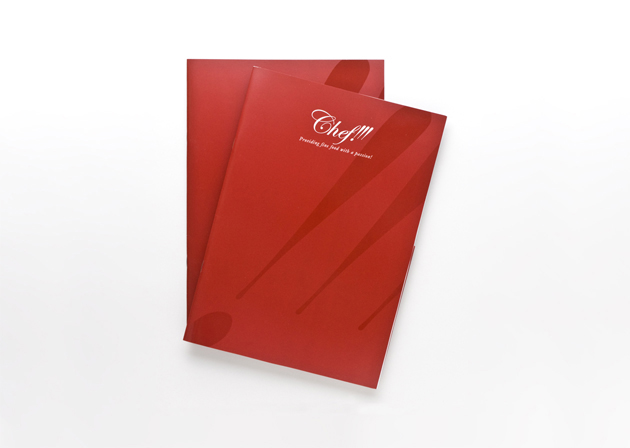
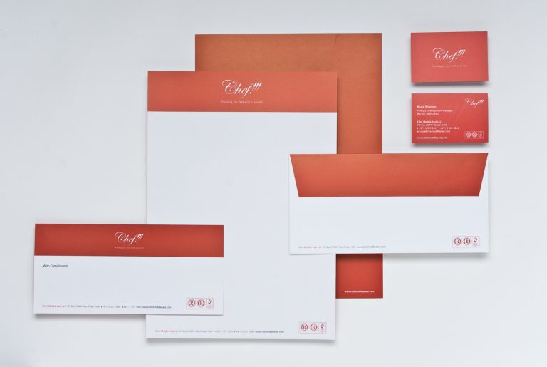
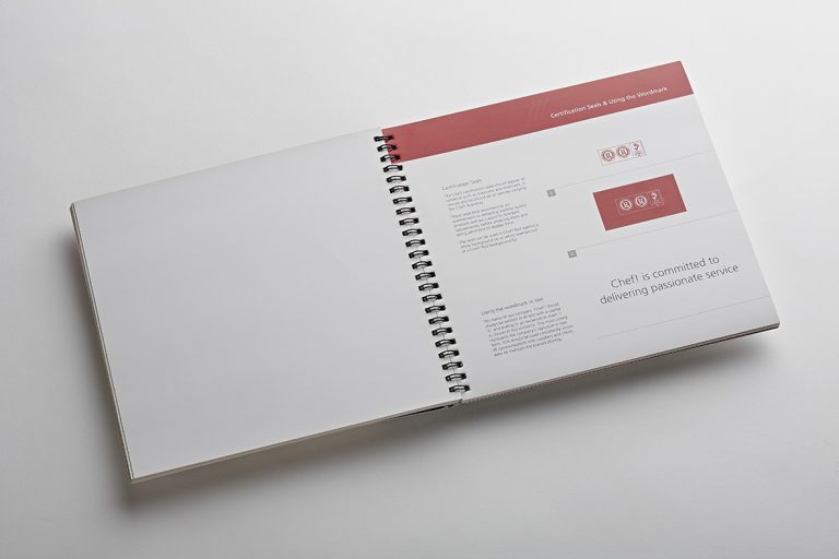
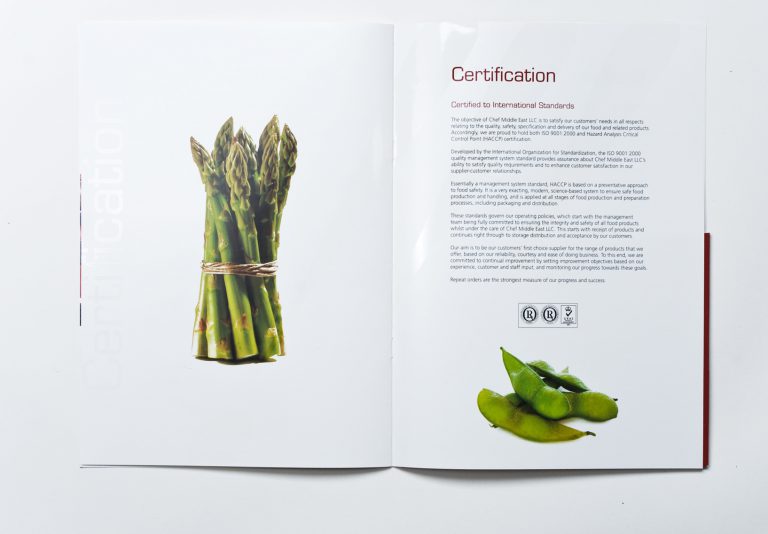
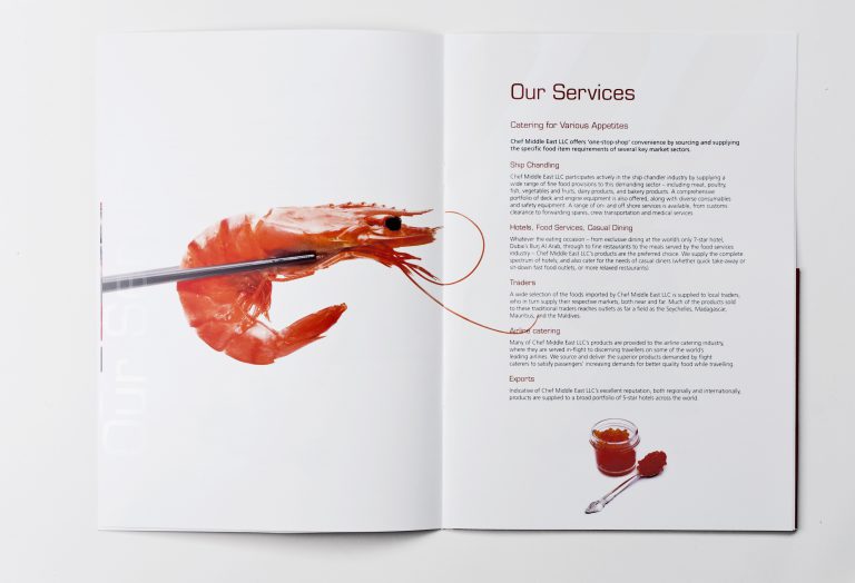
Client: Chef Work: Branding, Brandmark, Collateral
Living up to its promise to customers of ‘providing fine food with a passion’, Chef! is a purveyor of top quality standard and gourmet food ingredients. The initial brief was to design a corporate brochure and before long a strong relationship developed – Chef! soon included us in the company’s brand and strategy team.
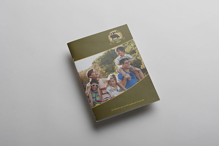
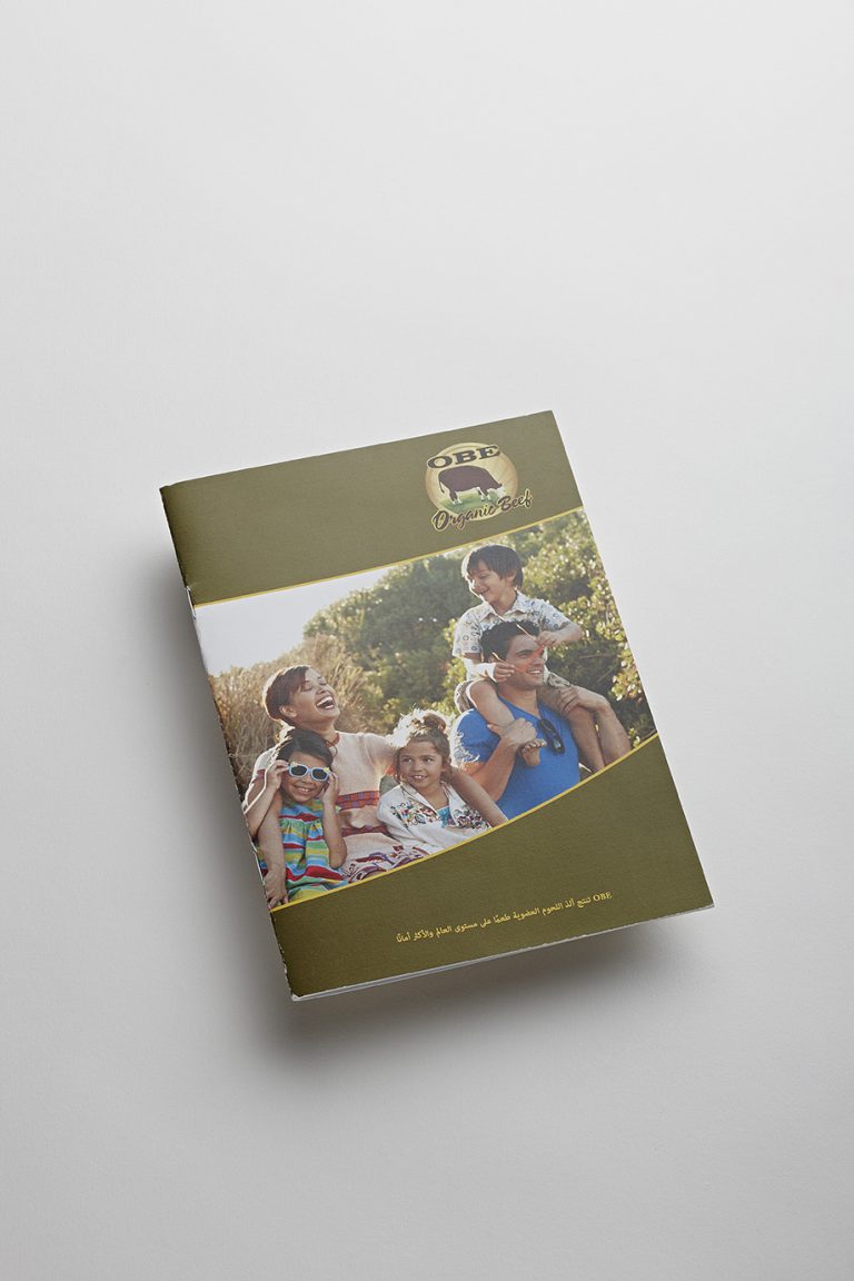
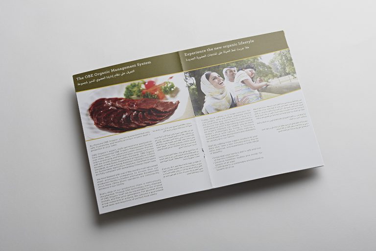
Client: OBE Organic Beef Work: Gulfood brochure – Direct Mailer
OBE contacted Mercury to use our creative ideas to have a brochure that could be used at the Gulfood. The brochure was in English and Arabic and helped increase the awareness of OBE as a new entrant to the GCC region,
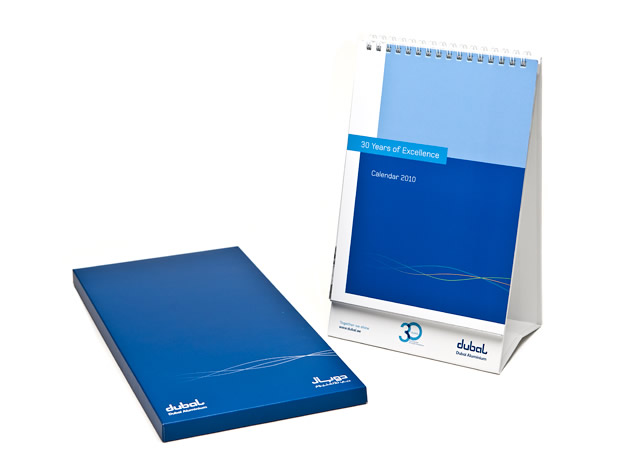
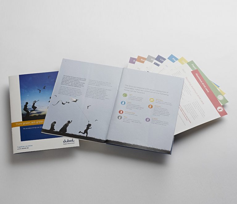
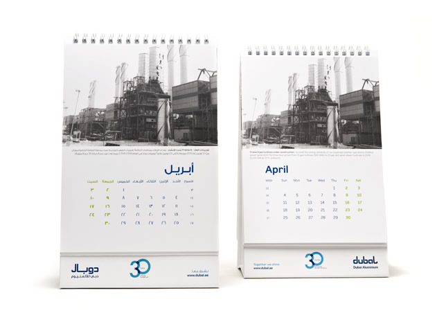
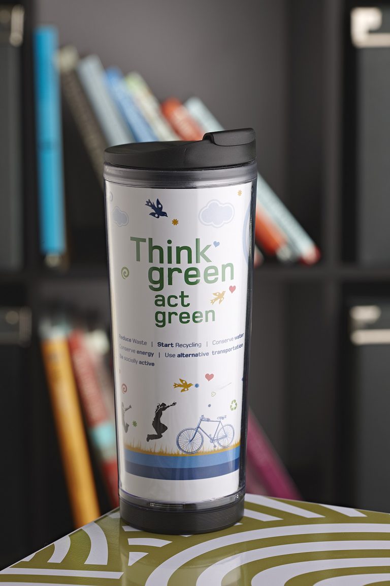
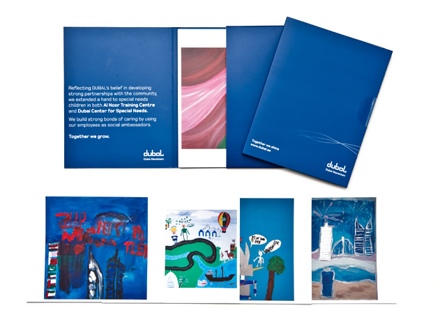
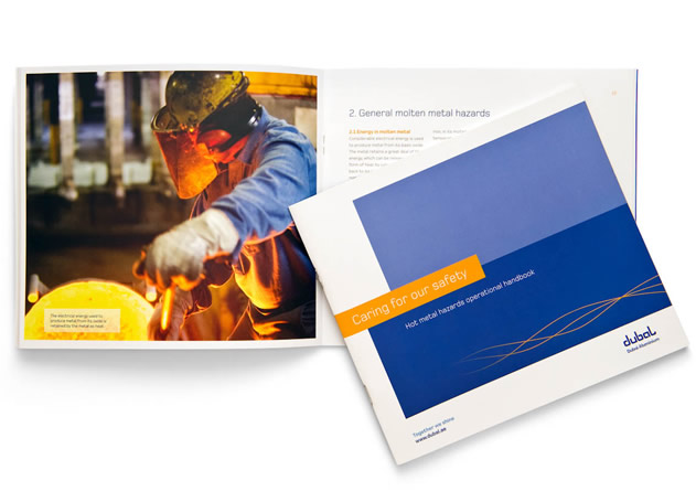
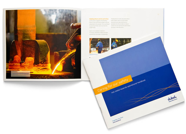
Client: Dubai Aluminium (Dubai) Work: Direct Mailer, Editorial Design
Dubal commissioned Mercury to design their internal collateral on safety communication. The hazard safety booklet is a part of a series and the team at Mercury needed to ensure that not only was the “hard factual” content displayed in a visually pleasing manner, follow guidelines and its importance not lost. The booklet is targeted at the staff recruited for that particular section.
Client: Mercury Work: Building Brand Awareness
Mercury believes very strongly in investing in brand Mercury. And so every year we do something that embodies our work and also leaves a lasting impression with our clients and potential clients. The section shows you some of our very successful self branding awareness exercises… Oh and today we have a database of people who want to be on our mailing list because they love to see what we have been doing every year! Invest in your brand – if done well it will always yield returns!
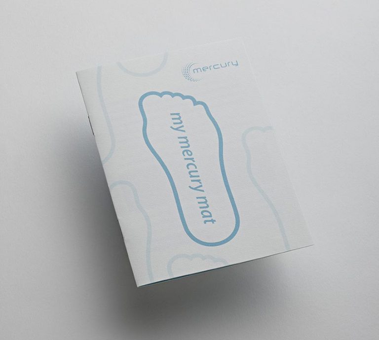
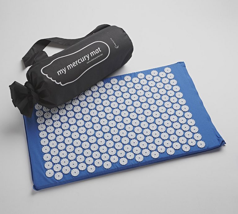
“shakti mat”
At Mercury we believe in not letting our clients be stressed, So we decided to go one step further and help them… The feet are your gateway to health … Did you know that by standing on the mat for just 10 minutes a day , you will feel recharged and motivated. This direct mailer which we sent out with a booklet and a handy bag (designed by us of course) has gotten Mercury many invites for meetings and led to a lot of business. message – Be wise with your corporate giveaways – they need to be creative and useful!
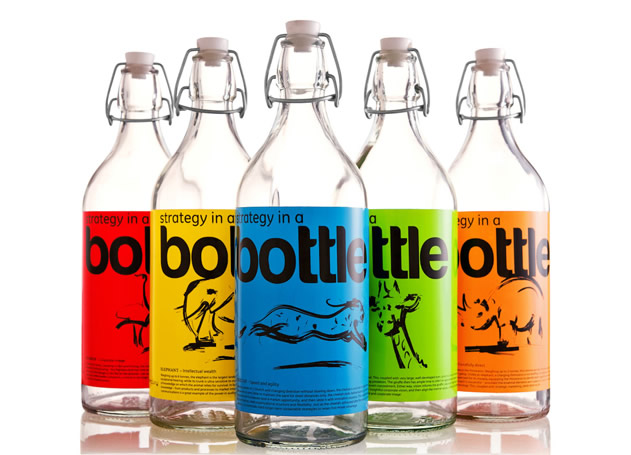
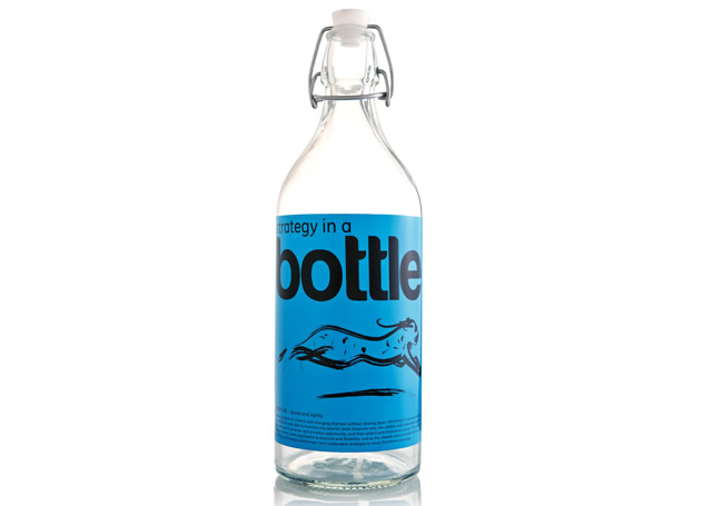
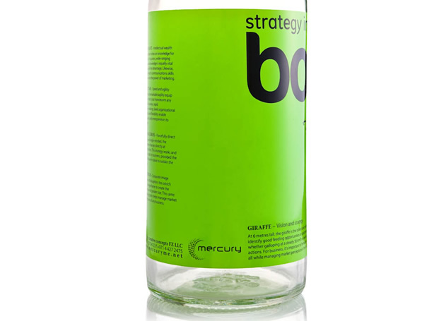
“unbottled creativity” The old adage says that its survival of the fiBest, we at mercury believe that in this day and age, it’s really survival of the most agile, knowledgeable and dynamic, that emerge truly successful. And, in navigating the forces of the corporate jungle, we liken ourselves to the personalities of the real survivors, the animals whose ins6ncts and fortitude inspire us.
The creative bottles come in 5 different colors and artworks showcasing the Mercury Creative Concepts experience – specifically our ability to understand our clients’ brands and deliver uniquely tailored, refreshingly different, tantalizing design solutions, everytime.
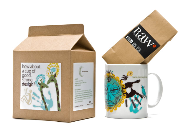
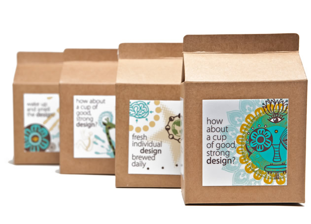
At Mercury, the team is from various corners of the world – we decided to create our own signature which we use on everything from mugs to ppt templates etc. Elements used in the design were inspired from Mexico, South Africa, India and Jordan. We also then decided to invite ourselves for coffee and actually had the coffee beans mixed up from all these countries – the mercury mix. With some awesome packaging using different artworks and messaging we were received very warmly and till today have loyal clients using our very own mugs!
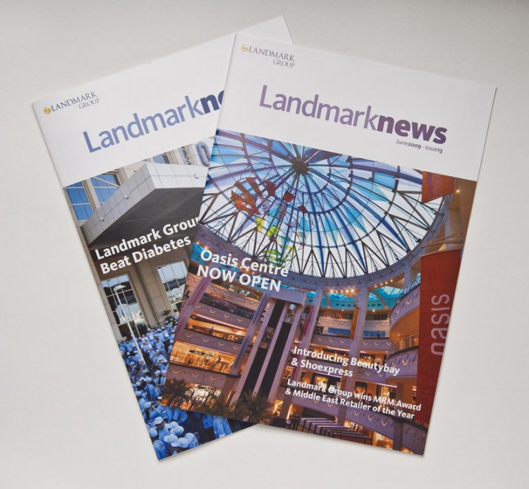
Client: Landmark Group Work: Internal Communications – Newsletter
Landmark Group was founded in Bahrain in 1973; and has since grown into one of the largest and most successful retail conglomerates in the Middle East. Aiming to keep its staff informed of company developments, achievements and events, the company issues a quarterly newsletter entitled “LandmarkNews”. Mercury was commissioned to produce the newsletter, using a vibrant, modern design so as to appeal to Landmark Group’s young and energetic workforce. A fresh, clean design template, balanced with relevant photographs, ensures readability and retention.
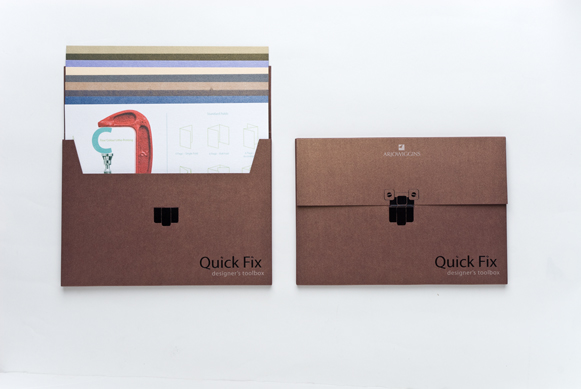
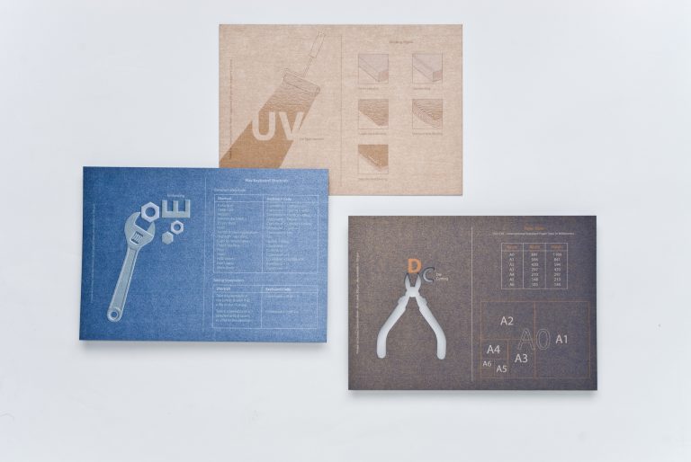
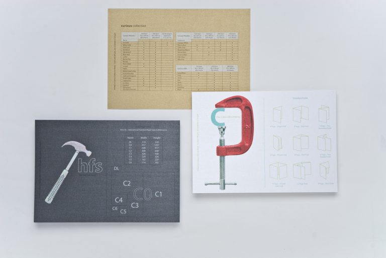
Client: Arjowiggins Work: Direct mailer, Increasing Sales
Arjowiggins, the French fine paper company and world’s leading manufacturer of creative and technical paper, operates across four continents and has 20 production facilities.
Brief
Marketeers and designers were not choosing particular colours, as they were unsure of how the paper would respond to printing. We needed to promote these products by developing a mailer to increase sales of the Curious Collection Metallic paper range.
Solution
We created the Quick Fix Designer’s Box, a direct mailer specifically targeted at designers and marketing professionals using samples of the Metallic paper range. Each insert contained different production techniques reflecting the versatility of the paper and carried useful information such as how spot UV, die cutting, silk screen printing, perforation and foiling appear, useful industry information and details, dimensions, weights of the paper itself.
Result
The mailer was a great success which also led to increased paper sales and due to heavy demand a reintroduction was necessary.
Having recently launched a new corporate identity, the organization required a full suite of corporate collateral plus interior & exterior branding of the DCCI head office. No application was too big or too small for our creative thinking. From trophies to notepads, brochures to certificates, window signage to corporate stationery, we applied the corporate identity elements using variations appropriate to the specific applications.
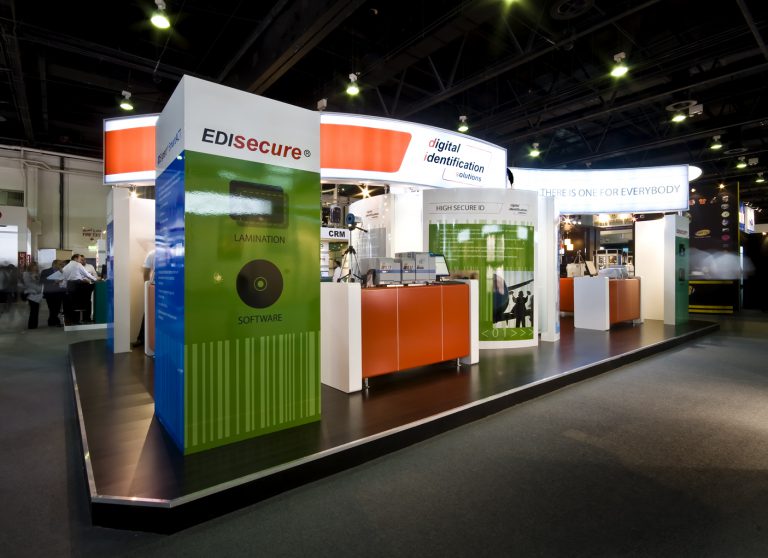
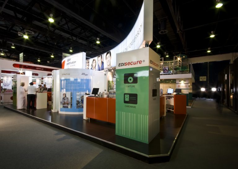
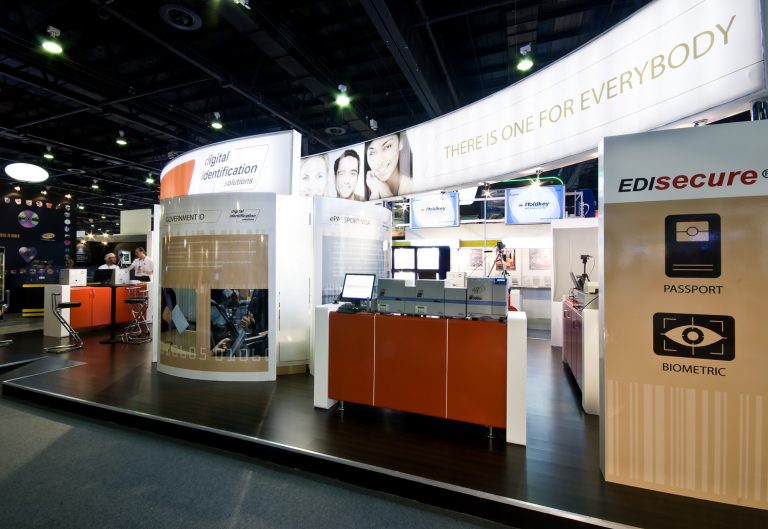
Client: Digital Identification Systems
Work: Exhibition Stand Design
Having decided to participate in GITEX Technology Week, DIS was looking for an exhibition stand that would offer exhibition visitors the chance to experience EDIsecure technology first-hand. A state-of-the-art stand design was developed, featuring interactive displays of EDIsecure technology. The stand also included a built-in, circular meeting room, which offered potential clients the option of more private discussions.
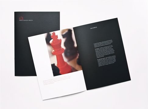
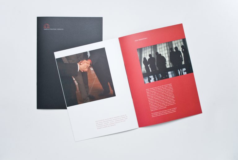
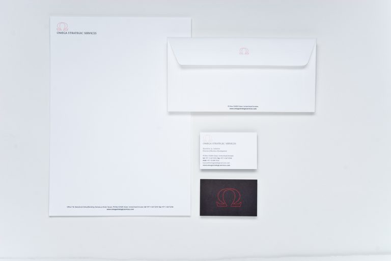
Omega Strategic Services (OSS) specialises in the delivery of sustainable operating environments by integrating integrated protection services, intelligence and risk advisory, operations support and negotiation support. Mercury was to create a bold corporate identity that would communicate the company’s strength, the serious nature of the business and the solid body of expertise within OSS. The next step was to apply the identity across a wide spectrum of communications collaterals.
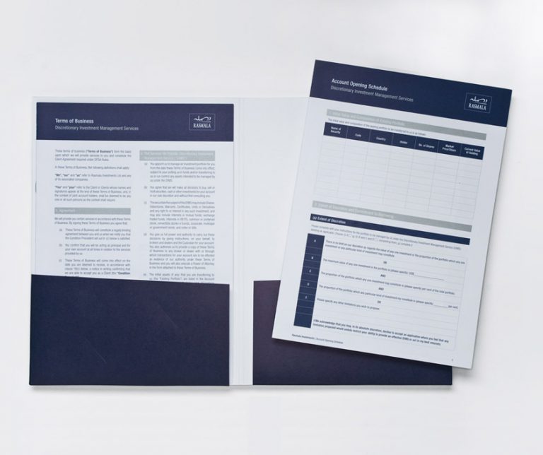
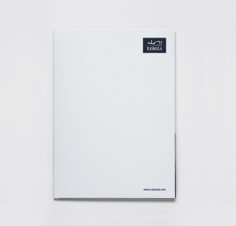
Client: Rasmala Investment Bank Work: Identity, Internal & External Communications
Rasmala Investment Bank is a leading regional investment-banking firm, headquartered in the Dubai International Financial Centre(DIFC). The need was identified to redress the lack of consistency in the marketing and communications collateral used across the group, as well as the different systems implemented in Rasmala’s various offices, by streamlining all financial forms and application of a unified visual system. Careful thought and creativity came together in this assignment: we developed a system that not only allowed for the logical flow of information and could be standardised across all offices, but which also reflected Rasmala’s corporate identity correctly.
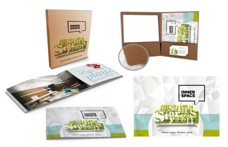
Innerspace Interior Design LLC offers a full range of services covering all aspects of interior design-and-build projects, including workspaces for corporate clients, showrooms and hospitality outlets.
Brief
The client requested a brochure and editable templates, in a digital format, to serve as sales tools – and all on an extremely tight deadline.
Solution
We created a very visual brochure with a casual tone of voice and templates using the client’s choice of software, which could be easily populated and printed. To bring the items together in a cohesive ‘pack,’ we designed and produced a folder, which included a ruler that could be used by the salespeople or customers during a consultation.
Result
A complete suite of digital templates and printed sales collateral, which could be customised by the client, to offer customers a truly professional presentation.
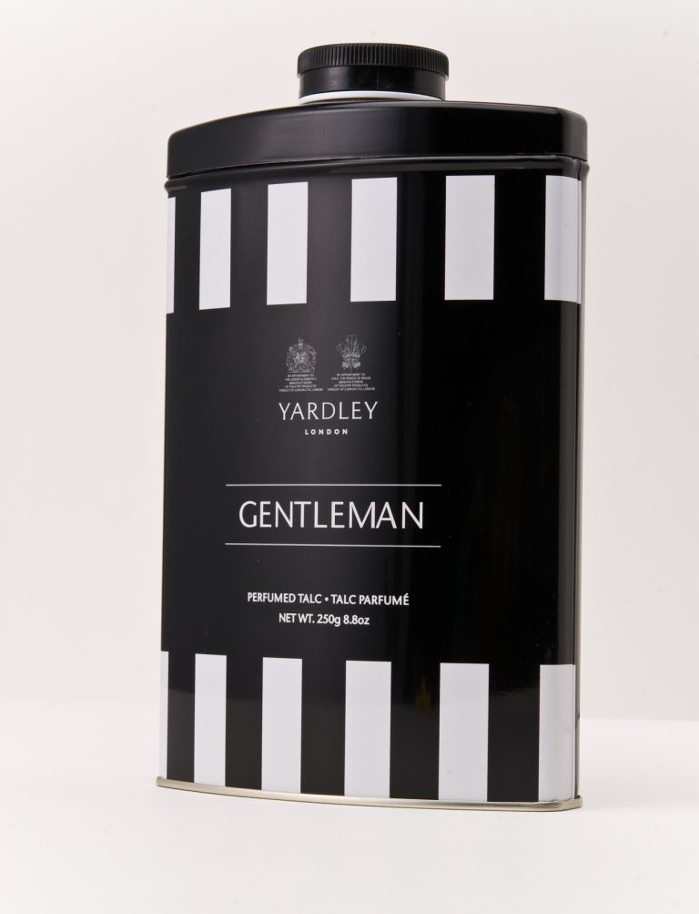
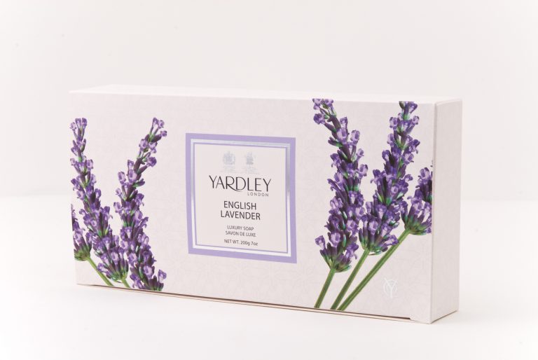
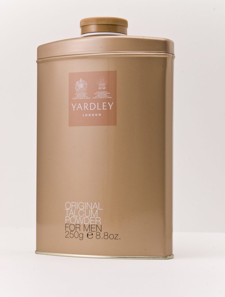
Established in London in 1770, Yardley has a well-established reputation for producing premium quality, beautifully scented bath soap, talcum powder and fragrances. The task of redesigning the packaging of select items in the existing Yardley talcum powder and bath soap was awarded to us, with the brief to make the merchandise bolder and eye-catching, so as to command a greater shelf presence and higher sales.
After extensive research, we developed packaging that is more modern than its predecessors, yet has retained the essence of Yardley’s classic heritage.
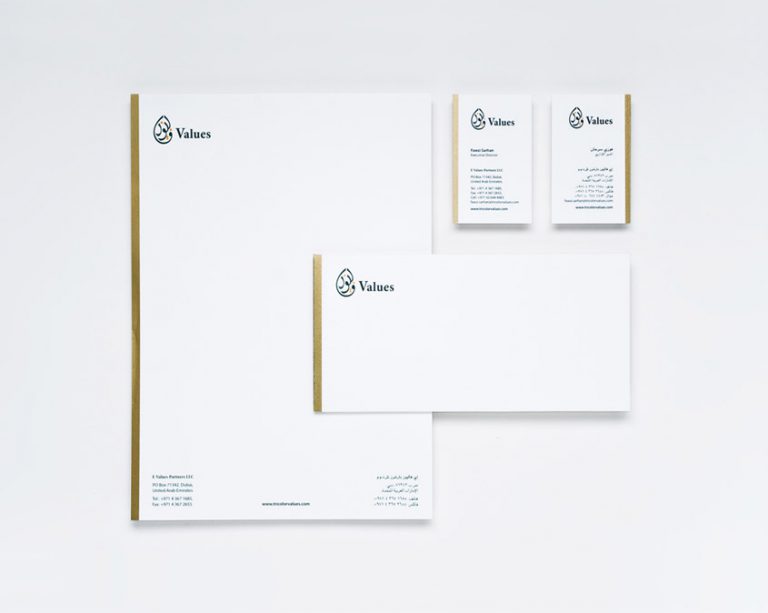
Client: Values Group Work: Branding, Brandmark, Collateral
Values Group required a corporate identity where the logo and visual system could be applied with equal impact in both English and Arabic.
By transliterating the word ‘values’ into the Arabic equivalent, and using this in a calligraphy style, Mercury created a unique logo for Values Group.
The colour palette blended with that of other companies, while a solid gold band running down the side of each stationery element ensured strong cohesion in terms of group-wide identity.